Duo-Wei Yang
Product Designer in Atlanta
TX Robot interface
June 2018
Wireframing, HTML/CSS, Frontend development
While I was working as a research assistant for a professor in Japan, I had the opportunity to work at Telexistence Inc, a startup based in Tokyo. This company's goal was to make a humanoid robot that could be controlled with human gestures, especially over a long distance.
One problem Telexistence had was inefficiency when testing or using the robot. Only one of the developers at the time was able to turn the robot on and off from his computer and terminal. Additionally, if one part of the robot was dysfunctional, its entire system had to be shut down and restarted, which took up a substantial amount of time. The company had a major demo that would happen in September 2018, so these issues needed to be dealt with before then.
To solve this issue, I was tasked with creating an interface so any user could turn the robot on and off and reset certain parts of the body (i.e. hand, audiovisual system). I accomplished this with HTML/CSS and Python frontend.


Wireframing
Defining the necessary elements
As the interface I was tasked to make would largely be used by the startup in early phases, the target users in this project were members of the startup. In order to define what was needed, my supervisor, the main UX designer of Telexistence, and I held discussions with others from the company. The following is what we came up with:
-
The ability for the robot to shutdown entirely
-
The ability for the robot to shutdown individual systems or parts
-
A parameter list for debugging
-
Ability to control robot from device if normal means are impossible
-
Being able to change the ro
Lo-fi Prototyping
To answer our main question — how our infinity room device was playful to the users — we built a physical prototype, observed how users interacted with it, and pointed out what was playful about it for that prototype. Then we contextualized our findings in the next prototype version and repeated the process.
In the span of 6 weeks, we made three different versions of prototypes of various sizes and shapes using cardboard, reflective material, Arduino lightbulbs, and motion detector.
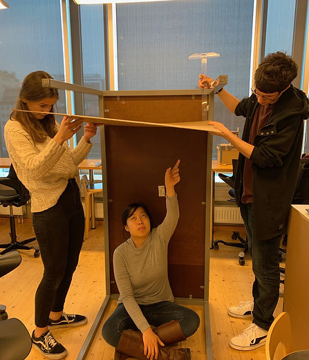
The main prototypes were a cube mirror box that was taped together with LED lights (top left), cardboard and table taped together to form a makeshift room to test bigger room sizes (right), and the final wooden octagonal box with mirrors (bottom left).


Usability Testing
During theses testings, we asked a set of questions to gather players’ opinions on what aesthetic, interaction and experience of our toy was playful and satisfying to them.
I prepared the interview questions, conducted the testings, and analyzed the results with my team. For 4 days, we tested 9 usability scenarios with 13 people from our class. Through this iterative usability testings were we able to define the key interactions of our toy. We used Sicart’s definition of a toy to analyze the interactions people do while playing with a toy.
1. Describe to me what you are doing right now and why.
2. What are you looking at right now?
3. Find an angle and perspective that’s most interesting to you.
4. Was there anything confusing or frustrating?
5. What was the most exciting moment?


Usability Testing with classmates (above), Usability Testing summary (below)
Hi-fi Prototyping
Through the iterative usability tests, we found out that players found interpreting the infinite images and creating their own image interesting and playful. Keeping that as the player experience goal of our toy, we wanted players playing our toy to be able to:
• Change the colors of the lights
• View the space and the infinite images in different perspectives
• Have a surreal, immersive experience
From these goals, we brainstormed possible interactions and designed physical elements of the toy that would enable those interactions.
Evaluating User Flow of the Toy
While observing the user testers, we noticed that some of them did not know how to start playing with the toy. They said they have never played with something like this before, so it was overwhelming for them. As a result, we wanted to enhance the user flow of playing our toy.
First, we visualized the user flow of our toy to point out specific areas of improvement for interaction, which is shown below:
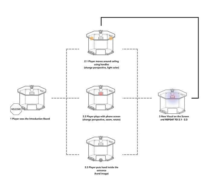
Doing so we added an instruction board that said to start interacting with the phone screen for the player - a visible element that would act as interaction touchpoint to guide the players on how to play with the toy. We also added gesture icons to help users understand what actions they can do at different parts of our toy, like a hand icon with arrows near the handles attached on the ceiling.


Gesture icons (left), Instruction board (middle), Hi-fi prototype (right)
Branding
To tie it all together, we branded the device to set up a player’s first impression and expectation of our toy. Modern, mysterious, and reflection were values we wished to reflect through our toy: Prism.

Reflection
Design an artifact that is easy to understand
Our toy offered various ways of interacting with it but they sometimes went unnoticed. In response, we worked on improving the affordances of our device (its shape, material, and physical design) to make it intuitive.
Building and testing constantly
In the beginning, we spent a lot of time discussing if our ideas were good ones, but along the way, we realized that building physical prototypes and testing all of our ideas and potential directions was the fastest way to know what ideas worked and why.
Accepting new changes, even if they're drastic
Our instructor's responses to a lot of our initial ideas were generally not exactly positive, so we often had to start from the basics multiple times. Our instructor's viewpoint was to starts from the ground up rather than have an idea and make it. This type of design process was very different from what we had experienced, which was intimidating. However, it let us experience a new type of thinking that helped us create our final prototype.
It’s boils down to teamwork.
Our team was one of the best ones I was ever in. We were enthusiastic and always volunteered to do certain parts of the work. There never was a dull moment, even in harder times. Promoting good teamwork through clear, open communication and encouraging each other's ideas helped push ourselves to design Prism within 6 weeks.


Overall, I am very satisfied with how our project turned out. Although it was a tough process, the feedback during play test sessions and the final presentation was positive. Our project, Prism received positive reactions including how fascinating and curious it was.
I'll highly miss this close-knit group I was in and I can't ask for better teammates than the people I worked with. I hope to continue this infinity room concept in future projects.